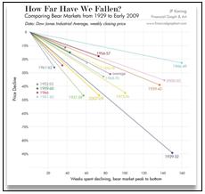
Andrew Sullivan recently posted an exceptional chart in his blog “The Daily Dish” that compares the current decline in the Dow Jones Industrial Average with other bull markets starting with the big one in 1929. The chart shows the depth of the decline for each bull run and the length of time it took to reach the bottom before recovering. Click on the image below for the full chart.
Content is for general information purposes only. It is not investment advice or a solution to buy or sell securities. Opinions are the authors; not necessarily that of OANDA Business Information & Services, Inc. or any of its affiliates, subsidiaries, officers or directors. If you would like to reproduce or redistribute any of the content found on MarketPulse, an award winning forex, commodities and global indices analysis and news site service produced by OANDA Business Information & Services, Inc., please access the RSS feed or contact us at info@marketpulse.com. Visit https://www.marketpulse.com/ to find out more about the beat of the global markets. © 2023 OANDA Business Information & Services Inc.
Latest posts by Scott Boyd (see all)
- Japan’s Demographic Trap - 25 June 2012
- Officials Talk Openly of Greek Euro Exit - 16 May 2012
- Greek Voters Prepare to Roll the Dice - 15 May 2012